If your website looks fine but isn’t bringing you calls or booked jobs, you don’t have a traffic problem. You have a conversion problem. A website that converts is built to do one thing the average site doesn’t: turn the strangers who land on it into customers who reach out.
That’s a different job from looking good. A site can be attractive, modern, and completely passive — a brochure that sits there while visitors read it and leave. This is about the opposite: a site that actively moves a visitor toward calling, booking, or filling out your form.
Here’s where conversions leak for service businesses, and how to plug each one.
What “converting” actually means for your business
You’re not selling a product through a checkout. For a service business, a conversion is one small action: a phone call, a filled-out form, a booked appointment, a text. That’s the finish line — getting an interested stranger to raise their hand.
The share of visitors who do that is your conversion rate, and for most sites it’s low. Across industries, lead-generation sites convert only a small single-digit percentage of their visitors, and it varies widely by industry. Most people who visit your site leave without doing anything.
That sounds bleak. It’s actually the opportunity. If your site converts 2 out of 100 visitors and you get it to 4, you’ve doubled your leads without spending a dollar more on traffic. Small fixes here pay better than almost anything else you can do.
The leak: a nice site with no obvious next step
The most common reason a site doesn’t convert isn’t ugliness. It’s that the visitor finishes reading and doesn’t know what to do next, so they do nothing.
They have to hunt for your phone number. The contact form is buried on a separate page. There’s no clear “here’s what to do” anywhere. A motivated visitor will sometimes push through that. Most won’t — they’ll assume reaching you is a hassle and go back to the search results.
Every page on your site should answer one question for the visitor: what do I do now? If it doesn’t, you’re leaking.

Make the next step obvious
Pick one primary action per page and make it impossible to miss. For most service businesses that’s “call us” or “get a quote.” Put it where people can’t scroll past it — at the top, again in the middle, again at the end.
Match the action to how your customers actually want to reach you. On a phone, that’s usually a tap-to-call button, not a number they have to copy. Some people would rather book a time without talking to anyone. Some want to send a message at night and hear back in the morning. Give them the path they prefer, and make that path the loudest thing on the page.
One clear action beats five competing ones. When you ask a visitor to “call, or email, or text, or book, or follow us,” you’ve made them choose, and a confused visitor picks nothing.
Cut the friction out of the form
When a visitor does decide to act, don’t make them work for it. Every extra field on a form is a small reason to quit, and they add up.
The instinct is to ask for everything up front — name, email, phone, address, job type, budget, how they heard about you. Resist it. You need enough to follow up and nothing more. Name and one way to reach them is often plenty; you can learn the rest in the conversation that follows.
It’s not as simple as “fewer fields always wins,” though. Studies on form length show that cutting a field that helps the visitor feel understood can actually lower conversions. The rule isn’t “ask the least possible.” It’s “ask only what you genuinely need, and cut everything else.” A short form that respects the visitor’s time will almost always beat a long one that interrogates them.
Answer fast, or the conversion doesn’t count
Here’s the part most owners miss. Getting the form filled out is only half of a conversion. What happens next decides whether it becomes a customer.
A lead goes cold fast. A well-known study of online sales leads found that contacting a new lead within about five minutes makes them roughly 21 times more likely to qualify than waiting half an hour. The person who filled out your form is sitting there with their phone, comparing you to two other companies. Whoever answers first usually wins.
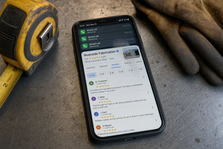
So a website that converts isn’t only about the page. It’s about what the page kicks off. The site captures the interest; fast follow-up closes it. If you can’t always answer in minutes — and no busy owner can, by hand — that’s exactly what an automatic instant reply and missed-call text is for. The site gets the hand raised; the system makes sure no one waits.

Put your proof where the decision happens
People decide to act at the moment they’re about to. So put your reasons to trust you right next to the action, not buried on an “About” page they’ll never open.
A short, real review beside your contact form. A line about your guarantee right under the “get a quote” button. A “licensed and insured” badge next to the call button. These aren’t decoration — they’re what tips a hesitating visitor from “maybe later” to “let’s do it.” The goal is simple: at the exact spot where you ask someone to act, give them one more reason to.

Measure booked jobs, not visits
You can’t improve what you don’t watch. Most owners look at the wrong number — visits, or worse, social followers. The number that matters is conversions: how many of your visitors turned into leads, and how many of those turned into paying work.
When you track that, the leaks show themselves. You see the page where people land and bounce. You see the form people start and abandon. You see the step where the path breaks. Then you fix that one thing, watch the number move, and do it again. That’s the whole game — not a prettier site, but a site you steadily make better at the one job it has.

How we build a website that converts at Blue Coast
I’ll be straight about how we approach this. We don’t build you a good-looking site and wish you luck. We build the site as a conversion system — clear actions, low-friction forms, proof where it counts — and we wire it to the follow-up that turns a lead into a booked job.
That’s the difference between a website and a website that earns. A pretty site that sits there is a cost. A site built to convert, tied to fast follow-up, is the hardest-working salesperson you have. It’s the same thinking behind our custom websites and the broader Business Autopilot system — and it’s the natural next step once the fundamentals of your site are solid.
What to do next
You don’t need more visitors this month. You need more of the visitors you already have to act. Start with the most obvious leak: is there one clear next step on every page, and does someone answer fast when a visitor takes it?
If you’re not sure where your site is losing people, take the free Automation Scorecard. A handful of quick questions, about a minute, and you’ll see your biggest bottleneck and the fixes worth making first. No sales call at the end — and if it makes sense, you can book a free audit right from your results.