Terrible website designs is the problem this guide helps a business owner diagnose before making the wrong next move.
A plumber called us in March after watching his website sit quiet for three months. Zero contact forms. Maybe two phone calls total. He had paid someone to build the site the year before, and it looked fine on his office computer—clean layout, nice photos of his trucks, a blue contact button in the corner. Then we pulled it up on a phone. The contact form required nine fields including a street address and preferred appointment time. The phone number was buried at the bottom of the page. The whole thing took six seconds to load on 4G. He had been losing jobs to competitors for ninety days because nobody could figure out how to reach him.
We have been building websites for HVAC, plumbing, electrical, and cleaning companies since 2018, and we have seen more broken sites than we can count. Some looked modern and did nothing. Others looked like they were built in 2009 but brought in steady work. The difference is almost never what you think it is.
This is not a list of the ugliest sites on the internet. This is a breakdown of fifteen terrible website designs we see killing service businesses every week—the ones that look fine until you realize nobody is calling.
1. The Contact Form Nobody Will Fill Out
We pulled up a client’s contact page last year and counted eleven required fields. Name, email, phone, street address, city, state, zip code, service type, preferred date, preferred time, and a message box. The form took up two full scrolls on mobile. The client could not understand why they were getting one or two submissions a month.
When someone’s air conditioner dies at nine at night, they are not filling out a loan application. They are looking for a phone number and a company that looks real. Every extra field you add cuts your conversion rate. Cut the form down to name, phone, and what is wrong. If you need their address, ask when they call.
The other half of this problem is where the form lives. If your contact page is the only place someone can reach you, and it is three clicks deep in your navigation, you are losing half your leads before they even try. Put a phone number at the top of every page where a thumb can tap it. If you are not sure how your own site stacks up on mobile lead capture, our free scorecard walks through the same checks we use.
2. The Phone Number You Can’t Find on Mobile
An HVAC company sent us their site to review. Desktop version looked great—phone number in the header, big and bold. Pulled it up on a phone and the number disappeared. It was tucked into a hamburger menu that required two taps to open, then a scroll to find the contact link, then another page load to see the number. By that point, the customer had already called someone else.
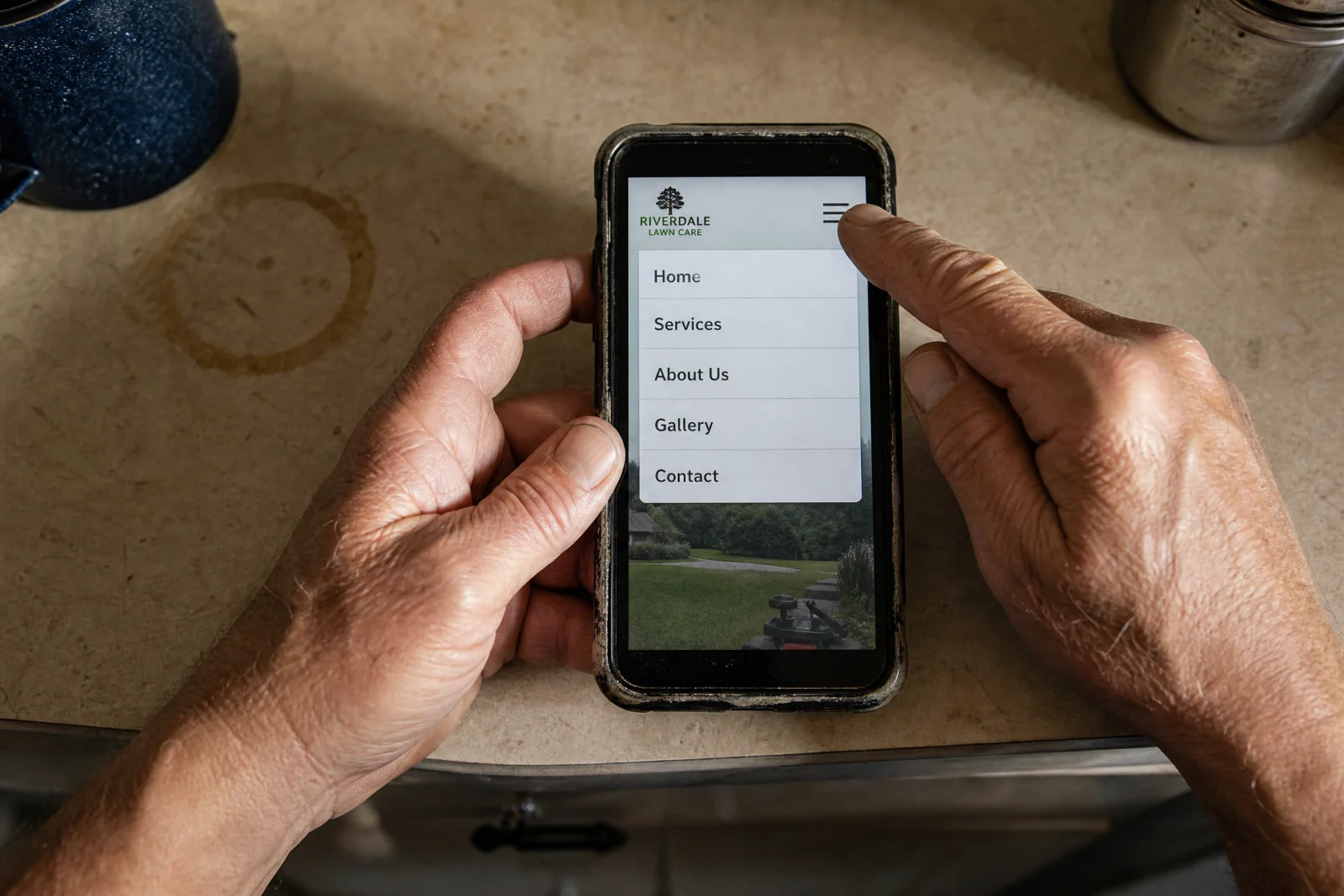
This is one of the most common terrible website designs we see, and it costs service businesses thousands of dollars a year. Mobile traffic makes up seventy to eighty percent of local searches, and if your phone number is not visible and tappable in the first three seconds, you are done. The customer is not going to hunt for it.
We started putting click-to-call phone numbers in a sticky header on every site we build. It stays at the top of the screen no matter how far someone scrolls. It sounds like a small thing, but we have watched it double call volume for clients who were struggling to get leads.
3. The Mobile Layout That Doesn’t Work
A cleaning company owner called us frustrated because their website looked perfect on their laptop but customers kept telling them the site was broken. We opened it on a phone and immediately saw the problem. The text was tiny and required pinch-zooming to read. The buttons were stacked so close together that tapping one would accidentally trigger another. The contact form fields were cut off at the edges of the screen.
This is what happens when someone builds a site without testing it on an actual phone. The layout might technically be responsive, but responsive does not mean usable.
The fix is not complicated. Open your site on your phone right now. Can you read the text without zooming? Can you tap the phone number without hitting the wrong thing? Does the form work without requiring you to scroll sideways? If the answer to any of those is no, your mobile site is costing you jobs.
4. The Navigation Menu With Fourteen Options
We rebuilt a site for an electrical contractor who had sixteen items in his main navigation menu. Services, Residential Services, Commercial Services, Emergency Services, About, About Our Team, About Our History, Testimonials, Reviews, Service Area, Contact, Request a Quote, Blog, Resources, FAQ, Careers. Half of them went to the same page.
When someone lands on your site, they need to know two things in ten seconds: what you do and how to reach you. A navigation menu with fourteen options does not help them figure that out.
The best service business sites we have built have four or five menu items. Services, Service Area, About, Contact. That is it.
5. The Page That Takes Six Seconds to Load
A landscaping client sent us their site to review, and the homepage took eight seconds to load on a phone. We dug into it and found the problem. The hero image was a 4MB photo straight off a DSLR camera, never compressed. The site was loading twelve different fonts. There were three chat widgets running at the same time, all fighting for resources.
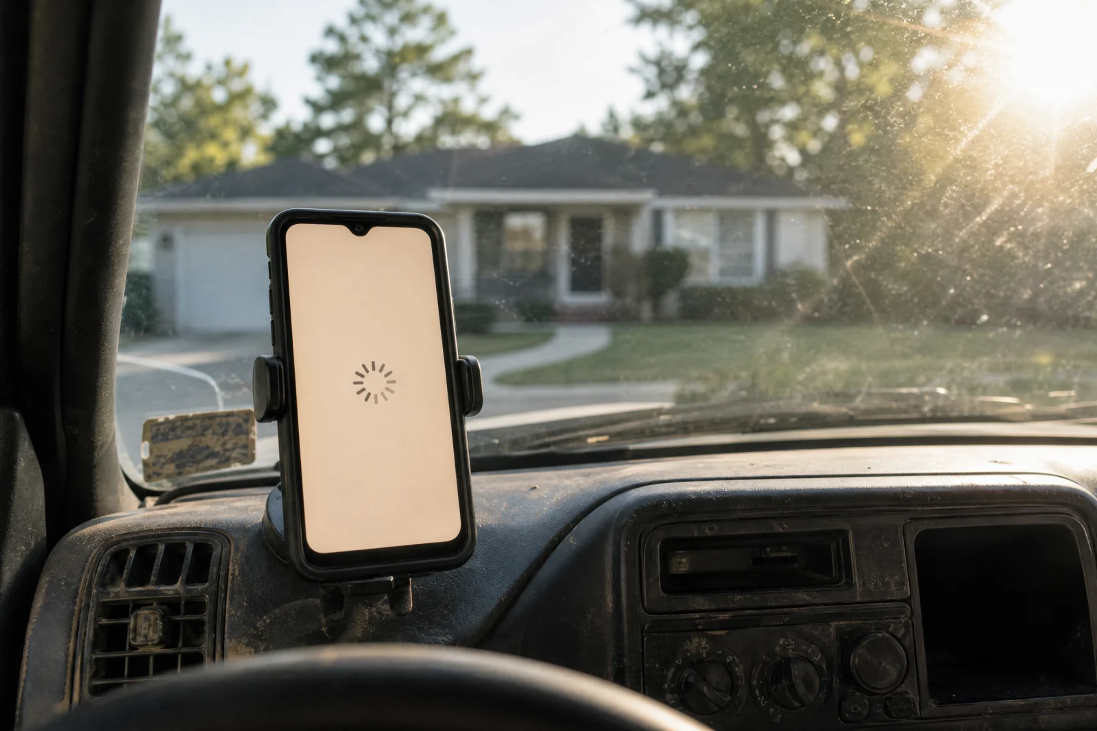
Speed is not about PageSpeed Insights scores or passing some technical test. It is about whether a customer on 4G in their truck waiting for the page to load will stick around or hit the back button. We have watched service businesses lose jobs because their site took too long and the customer assumed they were unprofessional or out of business.
The fix is usually the same. Compress your images before uploading them. Pick one or two fonts and stick with them. Get rid of plugins and widgets you are not actually using.
6. The Stock Photo Hero Section That Looks Like Every Other Site
We have seen dozens of HVAC sites that all use the same stock photo—a smiling technician in a blue shirt kneeling next to an air handler, giving a thumbs-up. The photo does not show their actual team. It does not show their actual trucks. It does not show anything that would make a customer trust them over the competitor using the same photo three spots down in the search results.
Stock photos make your site look generic. They make it look like you did not care enough to take real photos of your own business. We have rebuilt sites where the only change we made to the homepage was swapping the stock hero image for a real photo of the owner and their truck, and calls went up.
7. The Auto-Playing Video Nobody Asked For
A roofing company had a video that auto-played the second you landed on their homepage. Full volume. No way to stop it without scrolling down to find the pause button. The video was a two-minute overview of their company history, and it started loading immediately, which meant the rest of the page sat frozen while the video buffered.
Auto-play videos are one of the fastest ways to make someone leave your site. They are annoying. They slow down page load. They eat mobile data. And nobody watches them. If you have a video you want people to see, put a thumbnail with a play button.
8. The Color Scheme That Makes Text Unreadable
We reviewed a site for a sign design company where the homepage had white text on a light gray background. You could barely read it. The call-to-action buttons were bright orange text on a red background. The whole thing looked like it was designed by someone who had never heard of contrast.
If your text is hard to read, people will not read it. If your buttons do not stand out, people will not click them. This is not subjective design taste. This is basic usability. The Web Content Accessibility Guidelines set minimum contrast ratios for exactly this reason—readable text is not optional.
9. The Homepage With No Clear Next Step
A cleaning company sent us their site, and the homepage had six different calls to action. Request a Quote. Schedule a Consultation. Call Now. Email Us. Read Our Blog. Follow Us on Facebook. There was no hierarchy. Every button was the same size and color. A customer landing on that page had no idea what they were supposed to do next, so most of them did nothing.

Your homepage needs one primary action. For most service businesses, that action is either Call Now or Request a Quote. Make the most important action the most obvious one.
10. The Homepage That Doesn’t Say What You Actually Do
We reviewed a site last month where the homepage headline read “Innovative Solutions for Your Modern Needs.” No mention of what kind of solutions. No mention of what industry. No mention of what cities they serve. A visitor landing on that page has no idea if they are looking at a plumber, an electrician, or a consulting firm.
Your homepage needs to answer the most basic question a customer has: what do you do? If someone lands on your site and has to click around to figure out whether you fix air conditioners or install solar panels, they are not going to click around. Put your primary service in the headline.
11. The Broken Links and Missing Pages
An HVAC client had a Services menu that linked to four different pages. Two of them returned 404 errors. One of them redirected to the homepage for no clear reason. The fourth one worked, but the content was three sentences long and had not been updated since 2019.
Broken links make your business look abandoned. They make customers wonder if you are still operating. Test your site every few months. Click every link. Fill out your own contact form.
12. The Site That Hasn’t Been Updated Since 2015
We reviewed a plumbing site that had a copyright date of 2015 in the footer and a blog with the last post from 2016. The design looked like it was built before mobile phones existed. The testimonials section featured reviews from customers who probably did not even live in the area anymore.
You do not need to redesign your site every year, but you do need to keep it current. Update the copyright date. Add a recent review or two. If you have a blog and you are not using it, get rid of it.
13. The Testimonials With No Names or Photos
A landscaping site had a testimonials section with five glowing reviews. Every single one was anonymous. No name. No photo. No city. No date. They could have been written by the owner’s cousin for all anyone knew.
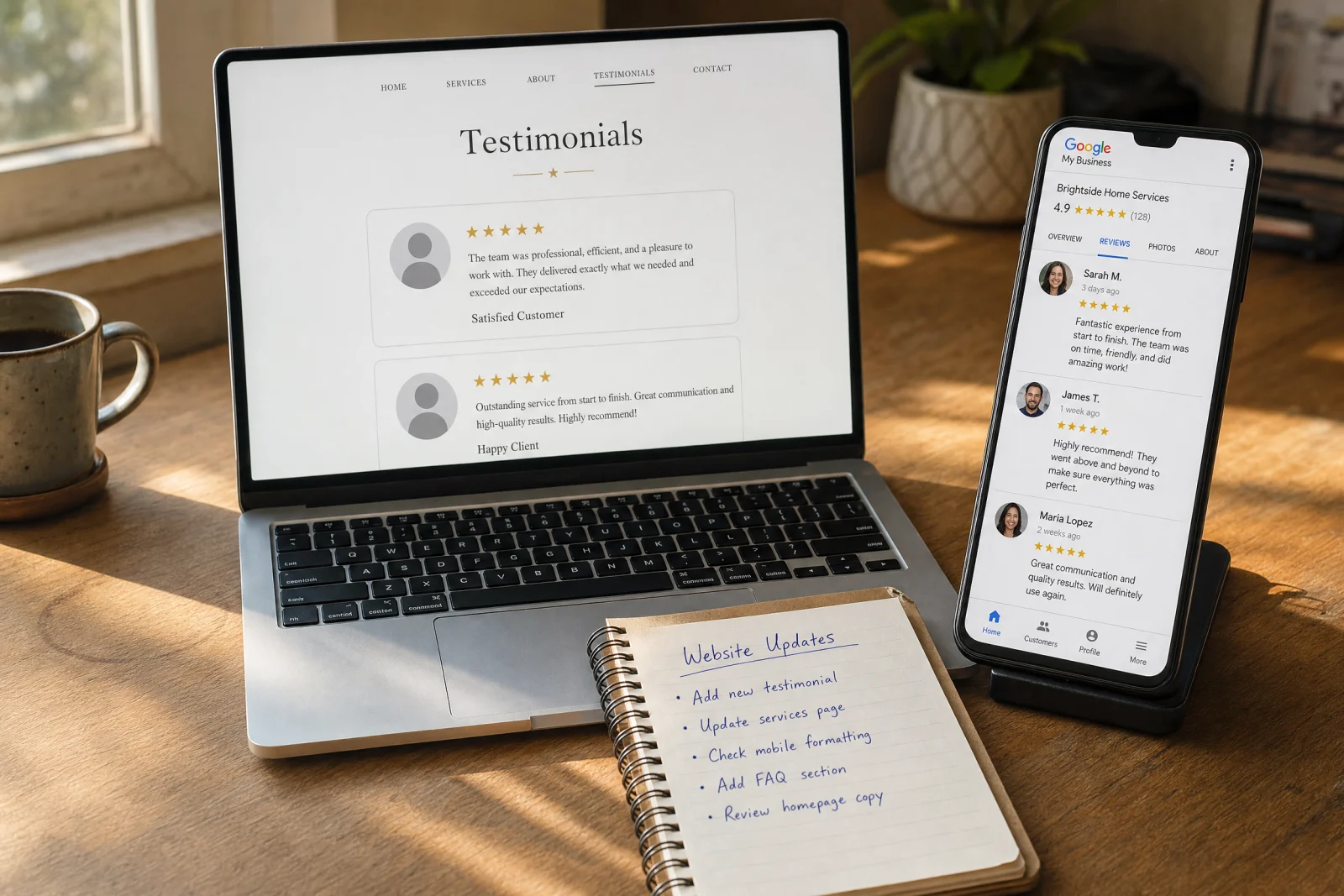
Testimonials only work if they feel real. A review from “John in Tampa” with a photo and a date is believable. A review from “Satisfied Customer” is not. If you are going to include testimonials, get permission to use real names and real photos.
14. The Chat Widget That Pops Up Every Ten Seconds
We opened a client’s site and within five seconds a chat widget popped up asking if we needed help. We closed it. Ten seconds later it popped up again. We closed it again. It kept coming back every time we scrolled to a new section.
Chat widgets can be useful if someone is looking for help and wants to ask a question. They are not useful if they interrupt the customer every ten seconds. If you are going to use a chat widget, set it to appear once, let the customer close it, and leave them alone.
15. The Site With No Trust Signals Anywhere
An electrical contractor sent us a site that had no reviews, no certifications, no licenses listed, no photos of completed jobs, and no mention of how long they had been in business. The homepage was a contact form and a paragraph of generic text.
Service businesses live and die on trust. A customer is letting you into their home or business. They need to know you are legitimate. Show your licenses. Show your certifications. Show real photos of your team and your work. Link to your Google reviews.
How We Actually Fixed Our Own Terrible Website Designs Without Hiring an Agency
We went through this same process with our own site a few years ago. One of us opened it on a phone in a coffee shop and realized the contact form did not work on mobile. The submit button was hidden below the fold. The phone number was not clickable. The whole thing was a mess, and we had been sending clients to it for months.
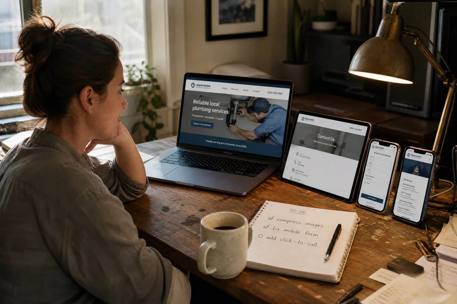
We started with the basics. Pulled up the site on three different phones and wrote down everything that did not work. Tested the contact form on desktop and mobile. Ran the homepage through Google’s Mobile-Friendly Test and fixed the errors it flagged. Checked the load speed on GTmetrix and compressed the images that were slowing it down.
The whole audit took maybe two hours. The fixes took another few hours spread across a week. We did not redesign anything. We made the broken parts work. Contact form got cut down to three fields. Phone number went into a sticky header. Images got compressed. Load time dropped from five seconds to two. Within a month, form submissions doubled.
You do not need to hire someone to do this. You need to open your site on your phone, click around like a customer would, and write down everything that frustrates you. Then fix those things one at a time.
Stop Redesigning and Start Fixing What’s Actually Broken
That plumber from the beginning of this article did not redesign his whole site. He cut his contact form down to three fields, moved his phone number to the top of every page, and compressed his images so the site loaded faster. Within two weeks, he got his first contact form submission in months. Within a month, he was getting three or four calls a week from the site.
Most service businesses do not need a redesign. They need to fix the one or two things that are costing them jobs. These terrible website designs share common problems: hidden phone numbers, broken mobile layouts, and contact forms nobody will fill out. Pick the biggest problem on your site this week—usually the contact form, the missing phone number, or the mobile experience—and fix it. Then measure what happens. Count the calls. Count the form submissions. See if it moves.
The difference between a site that brings in work and one that sits quiet is almost never the design. It is whether someone can figure out how to reach you in ten seconds or less. Avoiding these terrible website designs is not about perfection—it is about making sure your site works when customers need you most.