If you run a local service business and your website looks like everyone else’s in your industry, service business website design is the problem this guide helps a business owner diagnose before making the wrong next move.
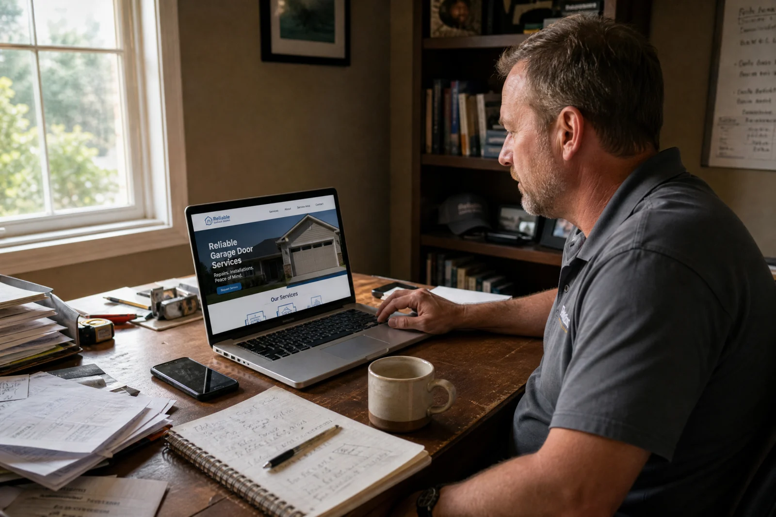
Last spring, we finished a website for a plumbing company in Tampa. Two weeks later, we launched one for an HVAC contractor in Charlotte. By summer, we had wrapped up a site for a landscaping business outside Atlanta. All three clients were happy. All three sites looked clean and professional. And when we pulled them up side by side one afternoon, we realized they were basically the same website with different logos.
Same layout. Same stock photos of smiling technicians. Same services page that could have been copied and pasted between all three. Same contact form asking for name, email, phone, address, and a message box nobody ever fills out. The only real difference was the color scheme—blue for plumbing, red for HVAC, green for landscaping.
We are not the only ones doing this. We have looked at hundreds of service business websites over the years, and most of them feel like they were built from the same blueprint. That blueprint works fine if your only goal is to have a website that exists. But if you actually want to stand out, book more jobs, and stop losing work to competitors who look exactly like you, that sameness is a problem.
The issue is not templates. Templates are fine. The issue is lazy thinking. When you build a service business website design without asking what makes this particular business different, you end up with a site that looks like everyone else in the industry. And when a homeowner is comparing three plumbing companies at ten o’clock at night with a burst pipe, the one that looks and sounds different is the one that gets the call.
We have spent the last year trying to break out of this pattern, and we have learned that most of the sameness comes down to five mistakes. Stock photos that make every business look generic. Services pages that read like they were written by a robot. Contact forms that nobody fills out. Layouts that follow the same tired structure. And a failure to figure out what actually makes one service business different from another.
Fix those five things, and your site stops looking like a template. It starts looking like a real business that real people want to hire.
The Stock Photo Trap in Service Business Website Design
Every HVAC company uses the same photo of a technician in a blue uniform smiling at a homeowner in a spotless kitchen. Every plumbing site has the same shot of a guy under a sink with a wrench. Every landscaping business has the same perfectly manicured lawn that looks nothing like the actual jobs they do.
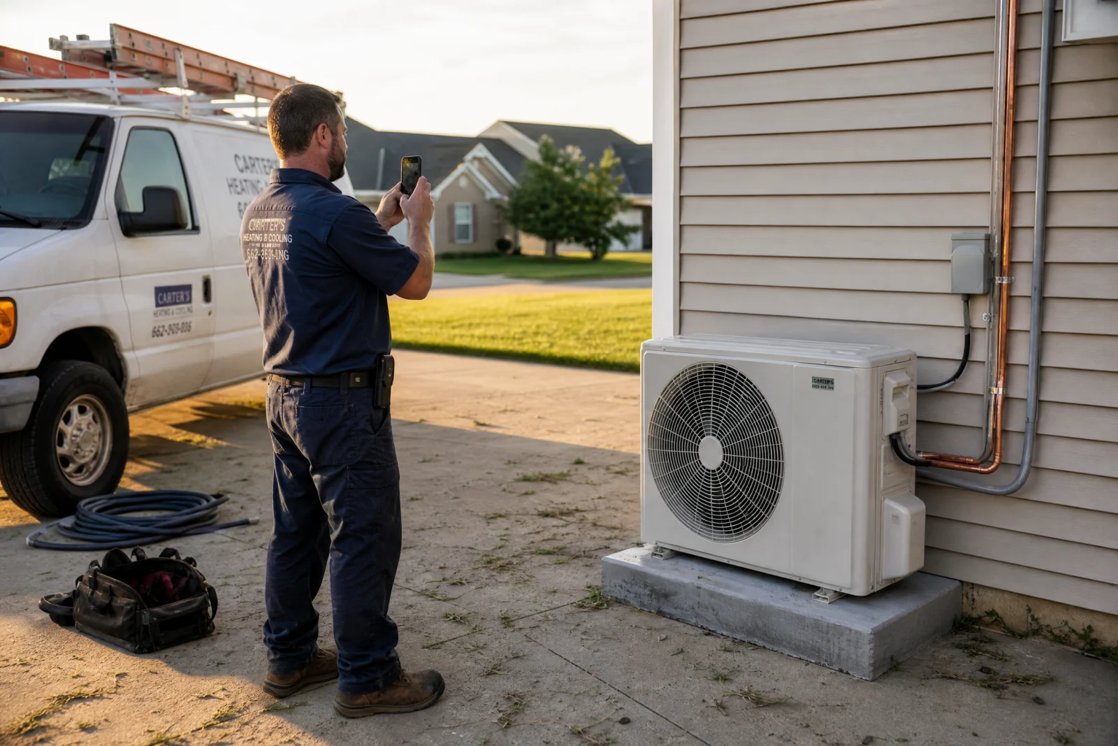
We get it. Real photos are hard. You have to remember to take them while you are actually working, and most service business owners are too busy running the business to stop and shoot photos. So they grab something from Unsplash or Pexels or Shutterstock, and it looks fine until you realize that three other companies in the same town are using the exact same image.
The fix is not complicated. Use real photos of your actual team, your actual job sites, and your actual customers. A blurry iPhone photo of your crew finishing a roof replacement is worth more than a perfect stock image of a model in a hard hat. People can tell the difference, and they trust the real thing more.
One of our clients started taking photos at the end of every job. A quick shot of the finished work, the truck in the driveway, the crew standing in front of the house. After six months, they had enough photos to replace every stock image on their site. The difference was immediate. People started mentioning the photos when they called—they felt like they already knew the team before they ever met them.
You do not need a professional photographer. You need a phone camera, natural light, and real work happening. That is the entire difference between a site that looks like everyone else and one that looks like you.
Why Service Business Website Design Gets Services Pages Wrong
We rewrote a services page for a pressure washing company last fall. The original version listed their services in bullet points: house washing, driveway cleaning, roof cleaning, deck restoration. Under each service was a paragraph that said something like “Our professional team uses industry-leading equipment to deliver exceptional results and exceed your expectations.”
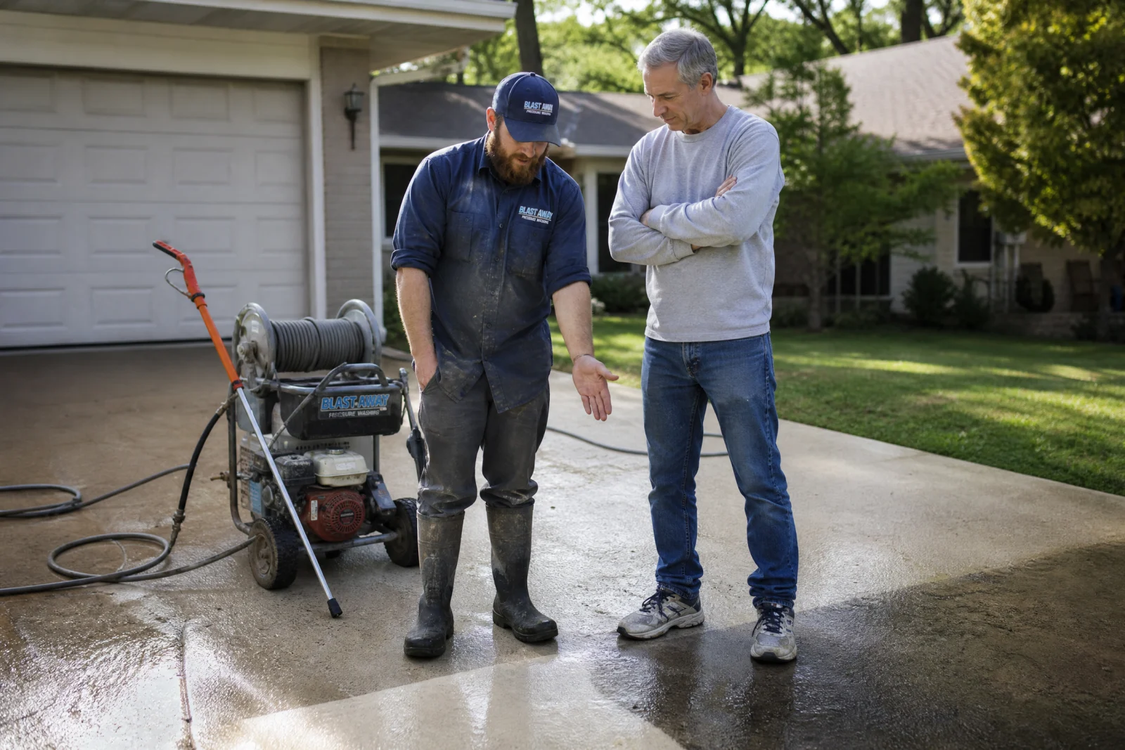
It was not wrong. It was useless. We could have swapped that page onto a competitor’s site and nobody would have noticed.
So we called the owner and asked him to tell us about the last three customers who hired him. What problem were they actually facing? What had they tried before calling? Why did they pick him instead of someone else?
The first customer had black streaks all over their roof and thought they needed a full replacement. The owner explained that it was algae, showed them photos of a similar roof he had cleaned the week before, and saved them twelve thousand dollars. The second customer had tried to pressure wash their own driveway, stripped the sealant off, and made it worse. The third customer was selling their house and needed the exterior cleaned in three days before the listing photos were taken.
Those three stories became the new services page. Instead of listing “roof cleaning” with a generic description, we wrote: “If your roof has black streaks, you probably do not need a replacement—you need a cleaning. We have saved homeowners thousands by removing algae that looks worse than it is.” Instead of “driveway cleaning,” we wrote: “Tried to clean your driveway yourself and made it worse? We fix that. Most DIY pressure washing strips sealant and leaves streaks. We use the right pressure and the right cleaner for the surface.”
The page went from sounding like everyone else to sounding like someone who actually understood the problems people were facing. And the owner started getting calls from people who said they picked him because he was the only one who explained what was actually wrong instead of listing services.
The fix is not better copywriting. The fix is talking to your actual customers and writing down what they tell you.
The Contact Form Mistake in Service Business Website Design
Most service business websites have a contact form that asks for name, email, phone, address, service needed, preferred date, preferred time, and a message box. And most of those forms sit empty because nobody wants to fill out nine fields when they need someone to fix their AC.
We have tested this dozens of times. The longer the form, the fewer people fill it out. And for service businesses, the form is not even the best way to get leads in the first place.
What actually works is a phone number at the top of every page, big enough to tap with a thumb, with a reason to call right now. “AC broken? Call us—most repairs done same day.” That is it. No form. No fields. A number and a reason to use it.
We rebuilt a site for an electrician last year and pulled the contact form off entirely. Replaced it with a click-to-call button and a single line that said “Need an electrician today? Call now—we answer every call.” His lead volume went up because people stopped trying to fill out a form and called.
If you absolutely need a form for after-hours inquiries, cut it down to name and phone number. That is it. You can ask for the rest of the details when you call them back. Every extra field you add is another reason for someone to close the tab and call your competitor instead. If you are not sure how your own contact form stacks up, our website scorecard walks through the same checks we use.
There is also a broader usability reason to keep forms short: the Nielsen Norman Group’s research on web form design shows how field labels, unnecessary inputs, and friction change whether people complete a form. For service business website design, that matters because every extra field can cost a real call.
How Better Service Business Website Design Stops the Copycat Problem
We looked at five plumbing websites in Jacksonville last winter. Four of them had the same layout: hero section with a photo of a truck, three service boxes, a testimonial slider, and a contact form at the bottom. Same structure, same colors, same everything.
The fifth one was different. It opened with a guarantee: “If we are late, your service call is free.” That was the first thing you saw. No generic hero image, no vague promise about quality and professionalism. A specific, risky promise that nobody else in the market was making.
That guarantee became the foundation for the entire site. The about page told the story of why the owner started offering the guarantee after a competitor left a customer waiting for six hours. The whole site was built around one thing that made them different.
We have seen this work for other service businesses too. A local service business website we built for a cleaning company led with “We bring our own supplies—you do not need to buy anything.” Another one for a landscaper opened with “We mow the same day every week, same time, no surprises.” These are not flashy differentiators. They are specific, true things that competitors were not saying.
The way to find your version of this is to ask: what do we do that nobody else in our market does? Not what you wish you did, not what sounds good in theory. What do you actually do right now that your competitors do not?
Once you have that answer, build the site around it. That is what breaks the pattern. That is what makes people remember you instead of lumping you in with everyone else they looked at.
The same principle shows up in Google’s own SEO Starter Guide: clear, helpful, specific content is easier for people and search engines to understand. A service business website design that says exactly who you help, what happens next, and why the owner should trust you will beat a generic template more often than another stock-photo hero section.
Audit Your Service Business Website Design Against These Five Mistakes This Week
Use this as a quick service business website design checklist before you publish or refresh a page: replace stock-photo proof with real job proof, make the first screen specific, simplify the services page, remove form friction, and lead with the thing your company actually does differently.
Pick one mistake from this article. Spend thirty minutes this week fixing it. Then move to the next one.

Start with the easiest win: replace one stock photo with a real photo of your team or a finished job. Take it with your phone. It does not need to be perfect. It needs to be real.
Then look at your services page. Read it out loud. If it sounds like it could belong to any other company in your industry, rewrite one section using a real customer story instead of generic benefit statements.
After that, check your contact form. If it has more than three fields, cut it down. If it does not have a phone number at the top of the page, add one.
Your competitors are not doing this. Most of them are still using the same stock photos, the same generic copy, the same long forms that nobody fills out. That is your advantage. The bar is low. When you improve your service business website design to actually look and sound different, it does not take a complete overhaul. It takes fixing one thing at a time until your site stops looking like everyone else’s.
We rebuilt those three identical websites we mentioned at the start. The plumber now leads with a same-day guarantee. The HVAC company replaced every stock photo with real job site images. The landscaper rewrote their services page using actual customer problems instead of vague promises. All three sites still use templates. But none of them look the same anymore, and their service business website design choices now reflect what makes each business unique instead of blending into the background.