Landing page for lead generation is the problem this guide helps a business owner diagnose before making the wrong next move.
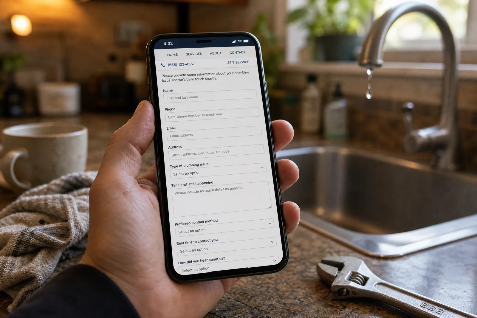
A plumbing client came to us three years ago with a problem that made no sense on paper. They were spending about two thousand dollars a month on Google Ads, getting decent traffic to their landing page, and the form looked fine. Clean design, professional photos, all the usual trust signals. But their conversion rate sat at eight percent while a competitor down the street was converting at twenty-two percent with a page that honestly looked worse. We pulled up both sites side by side and started clicking through like an actual customer at midnight with a burst pipe, and within about five minutes we found the problem. Their headline said “Professional Plumbing Services Since 1987” which told us nothing about whether they could help right now. The phone number was buried below three paragraphs of company history. And the contact form asked for street address, property type, preferred contact method, and best time to call before you even got to describe the problem. The competitor’s page said “Emergency Plumber Answers in 60 Seconds” with a giant phone number and a three-field form. The job went to whoever made it easier to ask for help.
We have been building landing pages for service businesses since 2018, and that moment taught us something we still use on every project. A landing page for lead generation is not about looking professional or checking off marketing best practices. It is about removing every single obstacle between someone who needs help and the moment they ask for it. Most service business landing pages hemorrhage leads before the visitor even sees the form, and the fix is almost never what people expect.
Why Your Landing Page for Lead Generation Is Hemorrhaging Leads Before They Even See Your Form
The plumbing client’s problem was not unique. We have seen it dozens of times with HVAC companies, electricians, cleaning services, and landscapers. Traffic shows up, bounce rate looks normal, but conversion sits in single digits while competitors with worse SEO and cheaper ads book more jobs. The issue is almost never the form itself.
We started tracking where people were leaving, and three patterns showed up over and over. The first was a value proposition problem. The headline and opening copy did not answer the one question every visitor is asking within three seconds of landing on the page, which is “Can you solve my specific problem right now?” A headline like “Your Trusted HVAC Partner” does not answer that question. When someone searches “AC repair near me” at nine at night in July, they need to know you fix air conditioners, you are available now, and you serve their area. If the headline does not say that in plain language, they are gone.
The second issue was what we started calling the trust vacuum. Service businesses load up the page with stock photos of smiling technicians, generic five-star review graphics, and badges that say “Satisfaction Guaranteed” with no context. But none of that actually builds trust for a local service call. We rebuilt a landing page for an HVAC company last year and replaced the stock photo hero image with a simple map showing their service radius and a line that said “Family-owned, based in Clearwater since 2019, we are ten minutes from you.” Conversion jumped from eleven percent to nineteen percent in the first month. People do not trust polish. They trust specifics.
The third culprit was friction in the ask. Most landing pages treat the contact form like the final step in a sales process, so they ask for everything up front. Name, email, phone, address, service needed, property type, preferred date, how did you hear about us. Every extra field cuts conversion. Forms with more than four fields converted at half the rate of forms with three fields or fewer. The worst one we ever saw had eleven fields including a dropdown for “What is your budget range?” and a checkbox to agree to a newsletter. It converted at four percent. We cut it down to name, phone, and a text box that said “What is going on?” and conversion went to twenty-six percent in two weeks.
The fix for all three problems is the same. Strip the page down to only what moves someone closer to asking for help, and cut everything else.
The Headline That Stops Scrollers Dead (And Why Ours Took Three Months to Get Right)
We spent three months testing headlines for a single landing page, which sounds ridiculous until you see the numbers. The original headline was “Experience the Difference of a Truly Clean Home” which tested at nine percent conversion. We thought it was fine. It was benefit-focused, it painted a picture, it sounded professional. But nine percent was not moving the needle, so we started testing variations.
The second version was “Book Your First Clean in 60 Seconds” which jumped to fourteen percent. The third version was “Home Cleaning in Tampa — Next-Day Availability” which hit eighteen percent. That one worked because it answered the two questions people actually had, which were “Do you serve my area?” and “Can you come soon?” But the version that finally broke twenty percent was “We Clean Homes in Tampa. Book Online, Get Confirmed in 5 Minutes.” It was not clever. It was not emotional. It told people exactly what would happen if they filled out the form, and that was apparently what they needed to hear.
The mistake that tanked performance on every other version we tested was trying to be too benefit-focused without being specific enough. “Experience the Difference” does not mean anything. “Truly Clean Home” is subjective. Even “Book Your First Clean in 60 Seconds” made people wonder what happened after sixty seconds. The version that worked removed all ambiguity. You will book online, we will confirm in five minutes, and we clean homes in Tampa. Done.
The lesson we took from that project is that a headline for your landing page for lead generation is not a tagline. It is an answer to the question “What happens if I contact you?” The more directly and specifically you answer that question, the better the headline performs.
What Sits Above the Fold When You Only Get One Chance
Above the fold, you have room for exactly four things. A headline, one line of supporting copy that clarifies the headline, a visual that reinforces trust or urgency, and the form or a button that opens the form. That is it.
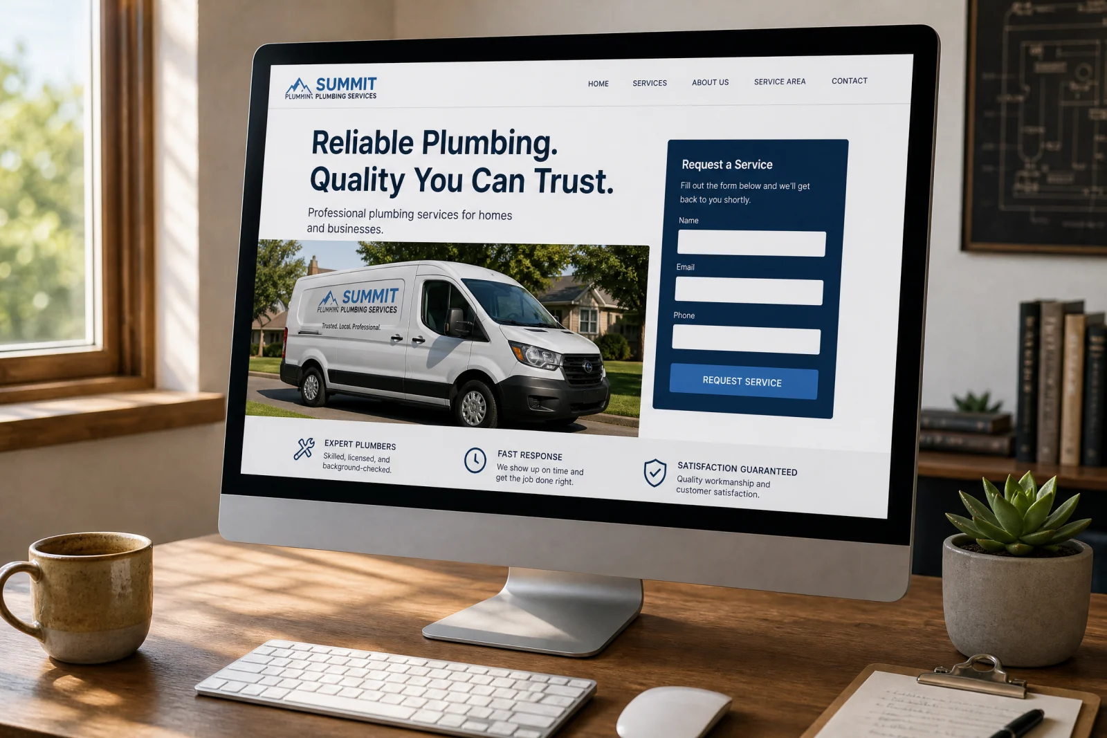
We have seen service businesses try to cram hero videos, testimonial carousels, trust badge rows, and feature lists into the top section of the page, and it always hurts conversion. The problem is not that those elements are bad. The problem is that they push the call to action down, and every pixel you make someone scroll before they can take action is a chance for them to leave. We tested this with an electrician client who had a beautiful hero video showing their team at work. It looked great. Conversion was twelve percent. We pulled the video, replaced it with a single image of a service van with the company name visible, and moved the form up. Conversion went to twenty-one percent.
The visual that works best above the fold is not the most polished one. It is the one that makes the business feel real and local. A photo of the actual team, a service vehicle with a visible phone number, or a simple map works better than stock photography every single time. White space matters more than filling every pixel. If the page feels crowded, people scan it and leave. If it feels clean and the path to action is obvious, they convert.
How We Built a Lead Form That Doesn’t Feel Like a Trap
The first lead form we ever built for a service business asked for nine fields. We thought we were being thorough. The client thought it looked professional. It converted at six percent, and after two weeks the client called us and said half the people who started filling it out were abandoning it halfway through. We pulled the analytics and saw the drop-off happening right around the address fields. People were willing to give their name and phone number, but asking for a full mailing address before anyone had even called them back felt invasive.
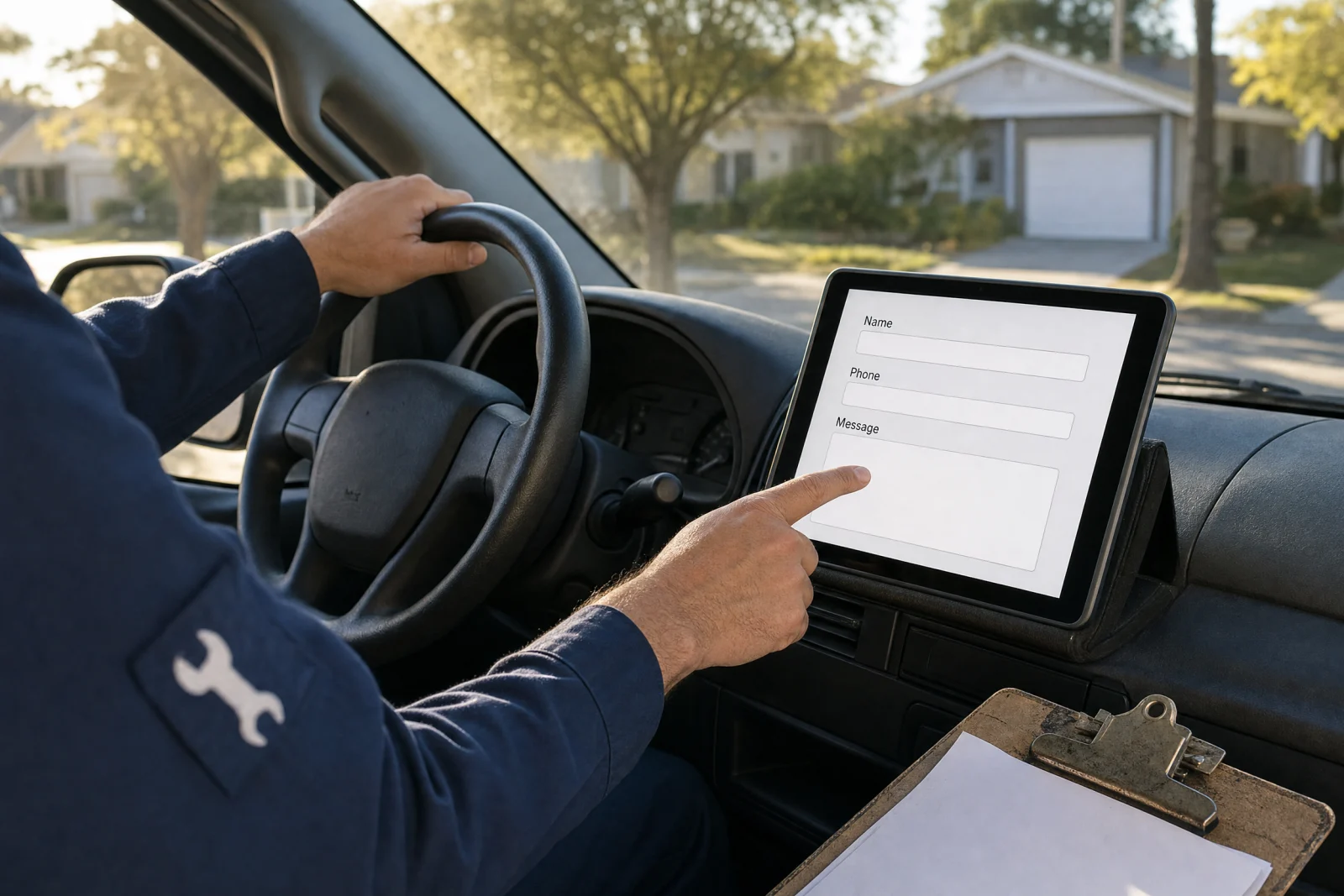
We rebuilt the form with three fields. Name, phone, and a text box labeled “What is going on?” Conversion jumped to eighteen percent in the first week. The lesson was that every field you ask for has to feel justified at that moment in the relationship. Name and phone make sense because that is how you call someone back. Asking what is going on makes sense because you need to know whether you can help. But asking for a street address before you have even confirmed you serve their area feels like you are collecting data, not trying to help.
Field order matters more than we expected. We tested two versions of the same three-field form with an HVAC client. One version asked for phone first, then name, then the problem. The other asked for name first, then the problem, then phone. The second version converted four percent higher. Our theory is that asking for a phone number up front feels like a bigger commitment than giving your first name, so starting with the easier ask builds momentum.
We also started using conditional logic on a few forms where it made sense. If someone selects “emergency repair” from a dropdown, the form asks for their phone number and nothing else, then fires an immediate text to the business owner. If they select “schedule a quote,” the form asks for email as well so we can send a confirmation. That added a little complexity to the build, but it cut response time for emergency calls from an average of twenty minutes down to under five. The form is not a data-collection tool. It is the first conversation with a potential customer, and the goal is to make that conversation feel as natural and low-pressure as possible. If you are not sure how your own forms are performing, our lead capture review walks through the same friction points we check on every project.
The Trust Signals That Actually Work (And Which Ones Are Noise)
The trust signal that moved the needle more than any other for our service business clients was a specific, recent case study result. Not a testimonial that says “Great service, very professional,” but a two-sentence story with a real outcome. We added a line to a plumber’s landing page that said “Last month we replaced a water heater in Seminole Heights the same day the old one failed — customer was back to hot showers by 6pm.” Conversion went up seven percent. It worked because it was specific enough to feel real and it showed exactly what the business could do under pressure.
The second trust signal that consistently performed was showing a real business address or service area. We added a simple map graphic to an HVAC landing page with a shaded radius and the text “We serve a 15-mile radius from our Clearwater shop — if you are in Dunedin, Palm Harbor, or Safety Harbor, we are close.” That one addition increased conversion by five percent, and we think it is because people searching for local services want proof you are actually local, not a national call center routing leads.
Everything else is noise. Generic trust badges that say “Satisfaction Guaranteed” or “Fully Insured” do not move the needle unless they are tied to something specific. A badge that says “Licensed and Insured” does nothing. A line that says “Florida licensed contractor #12345, liability and workers comp current” builds a little trust because it is verifiable. We tested a version of a landing page for lead generation for a commercial cleaning service that included logos of three local businesses they cleaned for, and it increased conversion by three percent. We tested the same layout with generic “As Seen On” media logos, and it did nothing. If the trust signal does not feel specific and local, cut it.
Your Thank You Page Is Either Capturing the Second Lead or Wasting It
Most contractors do not even think about the thank you page. The form submits, the page says “Thanks, we will be in touch,” and that is it. We ignored thank you pages for the first two years we were building landing pages, and then a client asked us what they should put there, and we realized we had been wasting a huge opportunity.
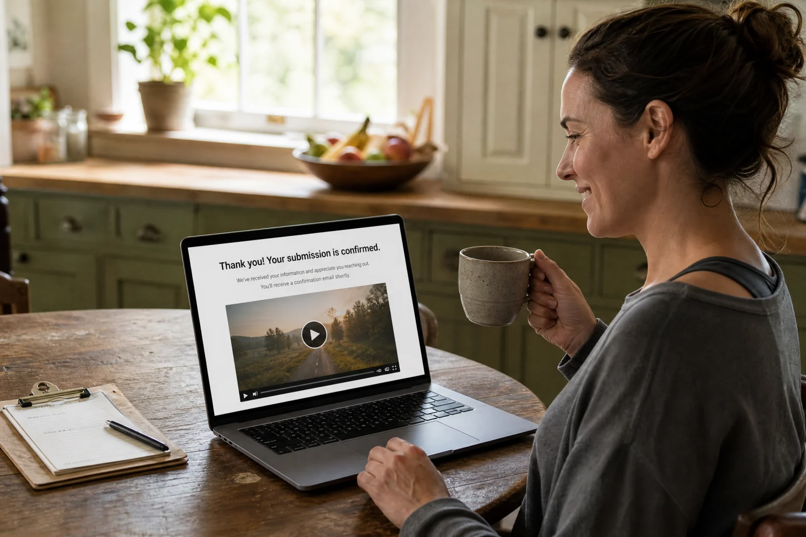
We started testing different approaches, and the one that worked best was using the thank you page to set expectations for what happens next and give people a way to take a second action while they wait. For an HVAC client, we added a paragraph that said “We will call you within 15 minutes during business hours. In the meantime, here is a short video that shows what to check if your AC is blowing warm air.” Below that we embedded a two-minute video and a button that said “Schedule a specific time for us to call you” which linked to a Calendly page. About thirty percent of people who hit the thank you page either watched the video or clicked through to schedule a call time, and the client told us it cut their average time-to-first-contact by forty percent.
The thank you page is not the end of the funnel. It is the moment when someone has told you they need help and they are waiting to hear back. If you leave them with nothing to do, they are going to keep searching and your competitor is going to call them first. If you give them something useful and a clear next step, you stay top of mind and you control the timing of the follow-up.
The One Thing That Breaks Every Other Element
We rebuilt a landing page for a landscaping company two years ago that had every element right. The headline was clear and specific. The form was three fields. The trust signals were real and local. The thank you page set expectations and offered a scheduling link. We launched it, watched the first week of traffic, and conversion sat at nine percent, which was worse than the old page. We could not figure out what was wrong until we tested the page on a phone and realized it took eleven seconds to load. The hero image was a high-resolution photo that looked great on desktop and murdered mobile performance. By the time the page finished loading, half the visitors were gone.
We compressed the image, lazy-loaded everything below the fold, and cut the page load time down to under three seconds. Conversion jumped to twenty-three percent in the next week. Speed is not one element of a high-converting landing page for lead generation. It is the foundation that every other element sits on. If the page does not load fast, nothing else matters, because nobody is staying long enough to see your headline or your form or your trust signals. We have seen this pattern repeat on almost every landing page for lead generation project we have worked on. The difference between a page that loads in two seconds and one that loads in six seconds is the difference between a page that converts at twenty percent and one that converts at eight percent. Google’s own research on page experience confirms that load speed directly impacts both user behavior and search rankings. That is the entire gap.