Lead generation website design is the problem this guide helps a business owner diagnose before making the wrong next move.

A plumbing company in Tampa called us last spring after spending three months with a redesigned website that looked great and did almost nothing. The old site had been ugly, but it brought in a few calls every week. The new one had custom photography, a clean layout, and exactly zero form submissions in ninety days. The owner was furious, and we could not blame him.
We pulled up the site on our phones and started clicking around. The homepage had a beautiful hero image of a gleaming kitchen faucet and a headline that said “Premium Plumbing Services Since 2001.” Three scrolls down, we found a phone number. The contact form asked for name, email, phone, service address, preferred contact method, type of issue, and preferred appointment window. It took forty-seven seconds to load on a decent mobile connection.
The problem was not the design. The problem was that the site answered questions nobody was asking.
When someone searches for a plumber at nine at night because their water heater flooded the garage, they are not reading about your commitment to excellence or your decades of experience. They are scanning for three things: proof you are real, proof you can fix their specific problem, and a way to reach you right now. If any of those three things require work to find, the job goes to the next search result.
We have been building sites for HVAC, plumbing, electrical, and other service businesses since 2018, and the pattern is always the same. A site that looks professional but buries the phone number gets fewer calls than a site that looks basic but makes calling easy. A site with a seven-field contact form gets fewer leads than one with three fields. A site that talks about the company gets fewer conversions than one that talks about the customer’s problem.
The Tampa plumber’s site was not broken. It was designed for the wrong goal. It was built to impress visitors, not convert them. And impressing someone who needs a plumber in the next hour is not hard. You have to make it easy for them to call you before they call someone else.
What we learned from rebuilding that site and dozens like it is that effective lead generation website design is not about looking good. It is about removing every possible reason someone might leave without calling. The next few sections cover the specific changes that made the difference between a site that generated compliments and one that generated jobs.
The First Thing Visitors See Needs to Answer One Question (And It Is Not “What Do You Do?”)
Most service business homepages open with a headline like “Trusted HVAC Services Since 1998” or “Your Local Electrical Experts.” And most of those sites wonder why visitors bounce after five seconds.
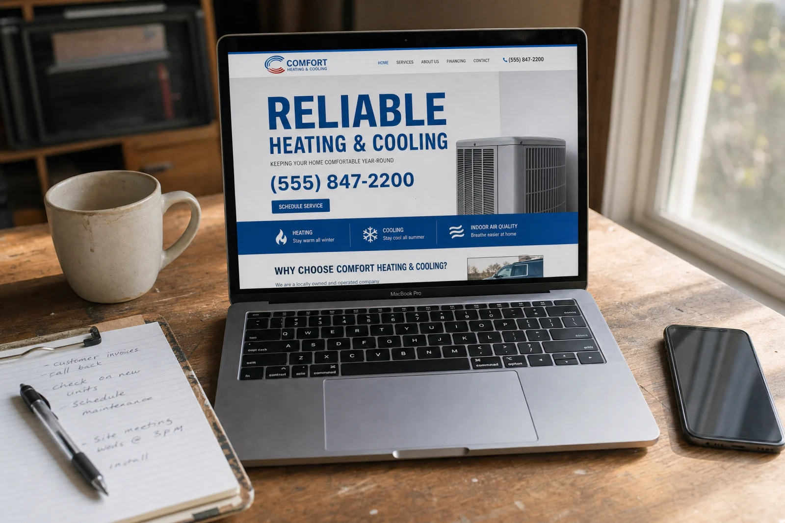
The question people are asking when they land on your site is not “What do you do?” They already know what you do because they searched for it. The question is “Why should I call you instead of the three other companies I have open in tabs right now?”
We rebuilt the homepage for an HVAC company last summer. The old headline was “Premium Heating and Cooling Solutions for Your Home.” The new one was “Same-Day AC Repair in Orlando. No Trip Charge If We Fix It.” Calls went up within a week. Not because the new headline was clever, but because it answered the actual question. It told people what they would get and what it would cost them to find out.
The alternatives do not work. Long taglines about family values and commitment to quality sound nice and mean nothing. Stock photos of smiling technicians do not differentiate you from anyone else. Trust badges and certifications above the fold are fine, but they do not answer the question of why someone should pick up the phone right now.
The headline is not marketing copy. It is the first filter. If it does not immediately tell someone they are in the right place and you can solve their problem faster or cheaper or better than the next guy, they leave. That is the entire function of the top of the page in your lead generation website design.
Contact Forms That Don’t Feel Like Homework
We have rebuilt contact forms for dozens of plumbing, HVAC, and electrical companies, and the fix is almost always the same. Cut the form down to three fields: name, phone number, and a brief description of the problem. That is it.
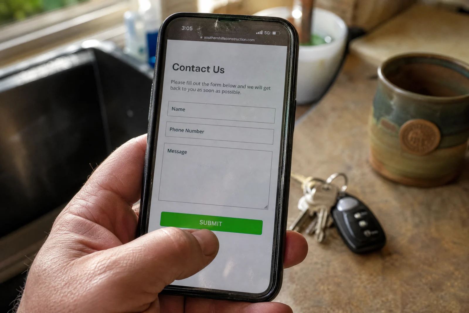
Every additional field you ask for cuts your conversion rate. Asking for email, service area, budget range, and preferred appointment time on first contact is asking someone to commit before they have decided to hire you. They have not even talked to you yet. They are trying to figure out if you are worth a phone call.
Phone number is non-negotiable for service businesses. Email is fine for content downloads and newsletters, but someone with a broken furnace in January is not filling out a form so you can email them back in six hours. They want to talk to a human who can tell them when you can show up and what it might cost.
The three-field form works because it does not feel like a commitment. It feels like the first step in a conversation. And that is exactly what it should be in your lead generation website design. If you are not sure whether your own forms are driving people away, our free scorecard walks through the same checks we use when auditing service business websites.
How We Built Trust Into Our Site Without Sounding Like Every Other Company
The first time we tried to add credibility to a contractor’s website, we did what everyone else does and added a testimonials page with five-star reviews and a few stock photos of smiling people. It looked fine. It did nothing.
The problem was that every other contractor site had the exact same page. Generic praise from people with no last names and no details about what actually happened. A visitor reading that page had no reason to believe any of it was real, because most of it probably was not.
We started over with a different approach. Instead of collecting generic praise, we asked clients for specific results. Not “They were great,” but “They showed up the same day, fixed the leak in forty minutes, and charged exactly what they quoted over the phone.” Not “Highly recommend,” but “We called three companies. They were the only ones who answered after 5pm.”
Then we added real names, real photos, and real project details. Before-and-after photos of actual jobs, not stock images. Video testimonials recorded on a phone, not scripted and edited. Specific numbers wherever possible: average response time, percentage of same-day appointments, typical job cost ranges.
The shift was from trying to sound impressive to trying to sound real. And the difference showed up in the calls. People started mentioning specific testimonials when they reached out. They would say “I saw the video from the guy in Winter Park, we have the same issue.” That never happened with the generic testimonials page.
These elements do not belong on a separate testimonials page that nobody visits. They belong scattered throughout the site. A testimonial about fast response time goes on the emergency services page. A before-and-after photo of a kitchen remodel goes on the remodeling services page. Proof works best when it shows up exactly where someone is deciding whether to trust you.
Mobile Visitors Bounce in 3 Seconds If Your Site Feels Like a Desktop Squeezed Down
Most calls to service businesses come from mobile searches. Someone’s AC dies, they pull out their phone, they search “AC repair near me,” and they call whoever looks easiest to reach. If your site takes eight seconds to load or the call button is buried below three paragraphs of text, they are already gone.

We have seen sites that looked perfect on a laptop and were completely unusable on a phone. Buttons too small to tap without zooming in. Forms that required horizontal scrolling. Phone numbers formatted as plain text instead of clickable links. Pages that loaded the header image first and the contact information last.
The fix is not making the site “mobile-friendly.” It is building the site mobile-first and treating the desktop version as secondary. The call button goes at the top of every page, big enough to tap with a thumb, formatted as a clickable link that opens the phone dialer. The contact form goes above the fold, not three scrolls down. The page loads the key elements first: phone number, headline, call-to-action.
Page speed matters more for service sites than it does for blogs or ecommerce. Someone reading an article might wait five seconds for it to load. Someone with a plumbing emergency will not. We have watched service businesses lose calls because their homepage took six seconds to render on a mobile connection. By the time the page loaded, the visitor had already hit the back button and called the next result. Research from Google’s mobile speed benchmarks confirms that the probability of bounce increases 32% as page load time goes from one to three seconds.
The test is simple. Pull up your site on your phone, start a timer, and see how long it takes to find the phone number and tap it. If it is more than three seconds, you are losing calls.
The About Page Is Not About You
We rebuilt a site for a landscaping company a few years ago, and the owner insisted on a long About page with the full company history, a paragraph about each team member, and a mission statement about exceeding customer expectations. We built it because that is what he wanted. Then we checked the analytics six months later.
The About page was the second most-visited page on the site, right behind the homepage. But almost nobody who visited it ever filled out the contact form or called. They read the page and left.
The problem was that the page was about the company, not about the customer. It answered questions like “When did you start?” and “What are your values?” instead of “Why should I hire you?” and “What happens after I call?”
We rewrote the page to focus on what the customer actually cares about. Instead of bios about each team member, we explained who shows up to your house and what qualifications they have. Instead of a mission statement, we included a FAQ section answering the questions people ask on the phone before they book.
The About page is one of the most-visited pages on every lead generation website we have built. People go there to decide whether you are legitimate and whether they want to work with you. If the page is a company history, you are wasting the visit. If it answers the questions they are trying to figure out before they call, it turns into one of your highest-converting pages.
Audit Your Site This Week Using This One Question
Here is what we want you to do before the end of the week. Pull up your website on your phone. Do not use your laptop. Use your phone, on a cellular connection, not wifi. Pretend you are a customer who searched for your service and landed on your homepage.
Now time how long it takes you to find the phone number and tap it. Count the clicks it takes to get to the contact form. Notice whether the form asks for three fields or ten. Check whether the page loads in two seconds or eight.
Then do the same thing on a competitor’s site. Pick the company that shows up right below you in search results. See how long it takes to call them. See how many fields their form has. See how fast their page loads.
If your competitor’s site is faster or easier, you are losing jobs to them every single day. Not because their service is better, but because their website makes it easier to become a customer.
Send this same challenge to everyone on your team. Ask your office manager, your lead technician, your spouse to do the same test and report back. The people who answer your phones and run your jobs know what questions customers ask before they book. If your site does not answer those questions in the first three seconds, you have work to do.
When you fix these issues, the results show up fast. More calls. Fewer tire-kickers who browse and never book. Higher close rates because the people who do call are already halfway sold by the time they reach you. That Tampa plumber we mentioned at the start? We rebuilt his contact form, moved his phone number to the top of every page, and rewrote his homepage headline to focus on same-day service. He got his first form submission in three days. By the end of the month, his lead generation website design was generating more leads than the old ugly one ever did, proving that smart lead generation website design choices make all the difference between a site that sits idle and one that books jobs.