Small business website design service is a phrase owners usually search after something has already gone wrong: a site that gets traffic but no calls, a quote that felt inflated, or a launch that slipped past the busy season. We have been building websites for service businesses since 2018, and the pattern behind most of those problems is the same. The site was designed to look finished instead of designed to produce a phone call.
This guide covers what we have learned across those builds: what belongs on the homepage, how to structure a contact form, which pages carry the weight, why mobile decides more than desktop, and where local SEO fits. It applies whether you hire the work out or build the first version yourself.
The most expensive mistake is not picking the wrong builder or the wrong template. It is waiting. A service business that stays offline through its busy season loses jobs it never even sees. The second most expensive mistake is overbuilding, spending weeks on pages nobody visits while the three pages that actually generate leads sit half-finished.
Here is what matters, in the order it matters.
The Homepage Mistake That Costs Months of Visibility
The most common homepage headline we are asked to fix says something like “Quality Landscaping Services.” Vague, forgettable, and useless for anyone trying to figure out whether the company can help them. No mention of the actual services. No mention of the city. It says the business does quality work, which is what every business says and what no customer searches for.
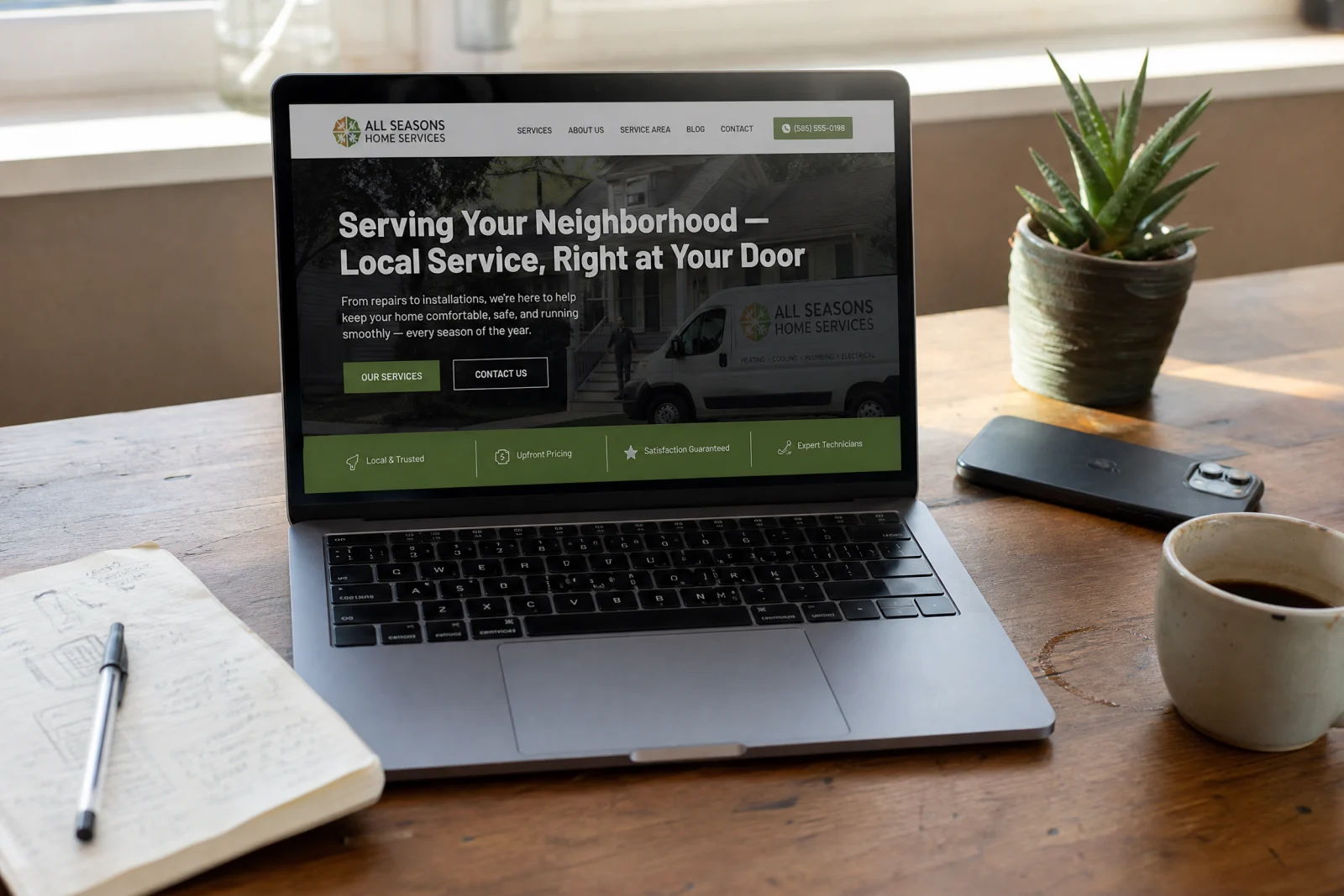
Search engines have nothing to rank a page like that for, and visitors have nothing to act on.
The failure usually happens because the design came first and the words came last. Owners spend hours picking colors and fonts and forget that a homepage has one job: tell someone what you do and where you do it in the first five seconds. A headline like “Lawn Care and Landscaping in Clearwater and Tampa Bay” beats “Quality Landscaping Services” because it matches what people actually type into Google. Do not make a homepage look good before you make it say something useful.
How to Build a Contact Form That Actually Converts (Instead of Existing)
The classic broken form has eleven fields. Name, email, phone, address, city, state, zip code, property size, service type, preferred date, and a comments box. The logic seems sound: more information means better-qualified leads. What it actually produces is fewer submissions, often none.
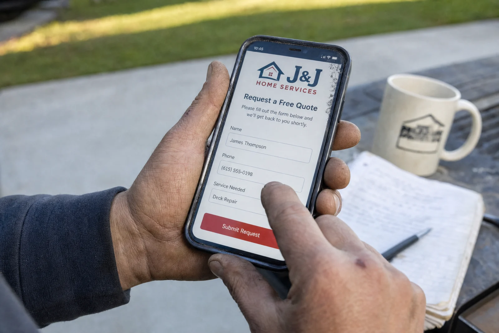
Here is the test we run on every form we build: pull it up on a phone and fill it out yourself, standing up, with one thumb. Typing a full address on a tiny keyboard after a long day feels like punishment. If you would quit halfway through your own form, so will a tired homeowner who wants someone to mow their lawn.
Three fields is usually enough: name, phone number, and what they need help with. No required email, no drop-down menus, no preferred-date picker. Anything else you need, you can ask when you call them back.
The lesson is not really about field count. A form is not a data-collection tool. It is the first conversation. If that conversation feels like an interrogation, people walk away. A prospect does not need to write an essay about their lawn. They need to give you a name, a way to reach them, and one sentence about the problem.
One more change worth making: put the phone number directly above the form. Many people who land on a contact page would rather call than type, and if the number is buried at the bottom or hidden in a footer, they leave. Make it big, bold, and click-to-call. If you are not sure how your own contact form stacks up, our website scorecard walks through the same checks we use.
The Small Business Website Design Service Pages That Actually Carry the Site
New sites tend to accumulate pages because a “real” business website is supposed to have pages. Blog. Portfolio. FAQ. Team bios. A process page. It looks busy, and busy feels productive for about a week.

Analytics tell a different story on service sites. Visitors use the site like a shortcut, not a brochure. They land, check whether you handle their job, look for a reason to trust you, and then try to contact you. That is the whole path. Any small business website design service worth paying for should understand that path before it starts adding extra pages.
So stop treating every page like it deserves equal attention. The service page gets the most work because that is where the money decision happens. List the actual services, whether that is lawn mowing, aeration, trimming, and seasonal cleanup or the equivalent for your trade, with plain descriptions and honest pricing clues. No mission statement. No paragraph about passion. Just the work and how someone can tell they are in the right place.
The about page does a different job. It makes the business feel real. One photo of the owner or crew in front of the truck, a few lines about the area served, how long the company has been working locally, and the licensed-and-insured note people always look for. Not a life story. Enough proof that the business will not disappear after a deposit.
The contact page is the utility drawer. Phone number, service area, hours, and the short form. No slow map embed. No social icons inviting people to leave. Just the information someone needs when they are ready to ask for help.
Everything else can wait. Extra pages on a new service site tend to collect a handful of visits and then get deleted later, and the site feels stronger without them, not smaller.
Why Mobile Breaks Everything Before Anyone Notices
Mobile problems rarely show up in a report first. They show up as customers who tried the form, could not hit the button, gave up, and called a competitor instead. Most of them never tell you.
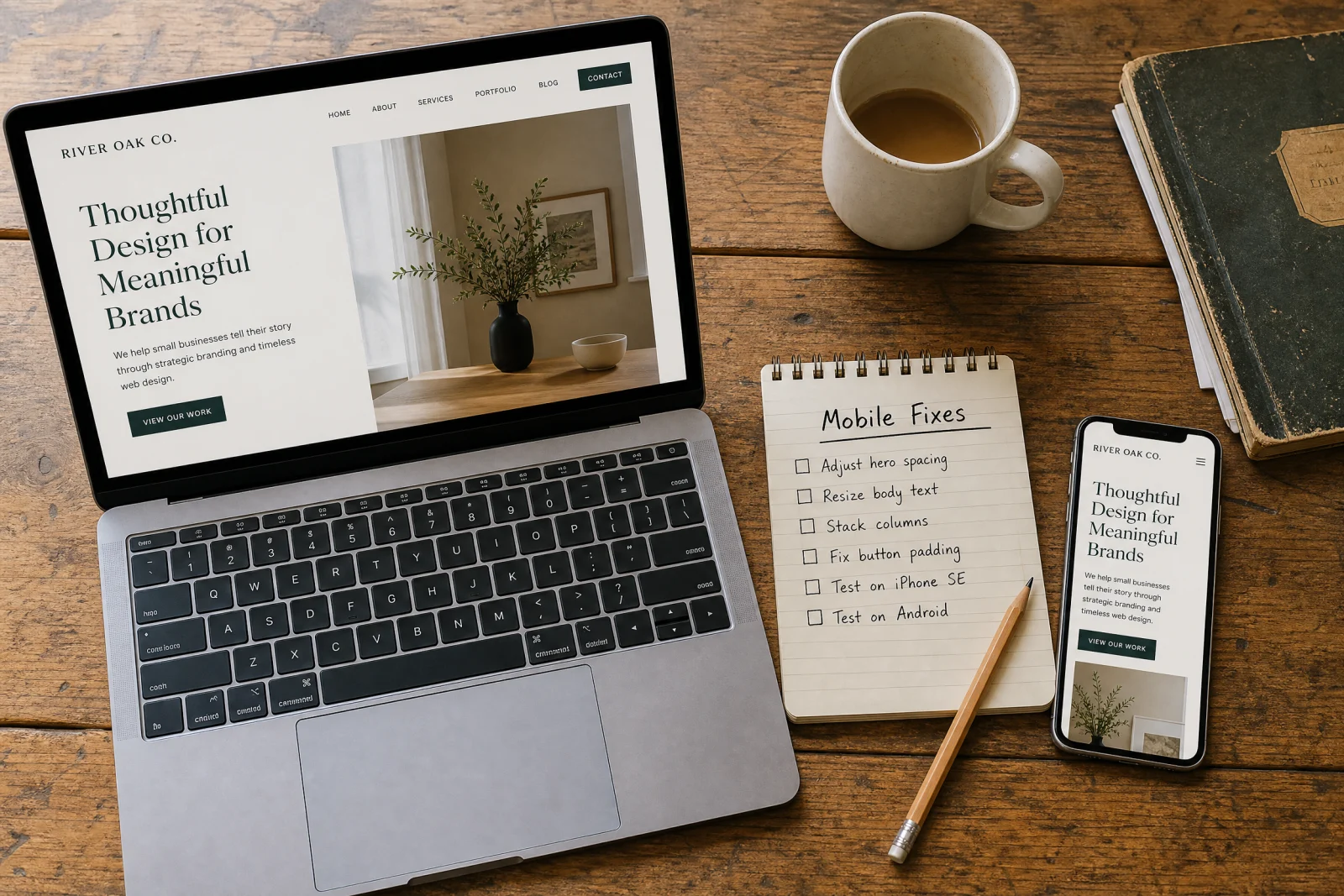
The trap is that sites get reviewed on a laptop. On a phone, that same site can have form fields packed together, a phone number rendered as plain text instead of a tap-to-call link, and photos so large the page drags before the first section loads. Nearly every builder includes a mobile preview mode. The discipline is actually using it, then testing the live site with one thumb before launch.
The fixes are boring, which is why they work. Bigger text. More space between form fields. Click-to-call on the phone number. Compressed images. A submit button a real thumb can hit. This is not a redesign. It is removing the friction that makes people quit.
Service businesses get searched from driveways, kitchens, job sites, and front porches. If the phone version is broken, the desktop version does not rescue you. Research on mobile usability points to the same fundamentals: tap targets, load speed, and form simplicity decide whether people keep going or leave.
The SEO Work That Belongs on Day One
Blogging sounds like SEO, so new service sites often launch with a stack of tips articles. Those posts make the owner feel productive while the phone stays quiet. General how-to content competes with national publications. A finished Google Business Profile competes with the shop down the street, which is a fight a local business can actually win.
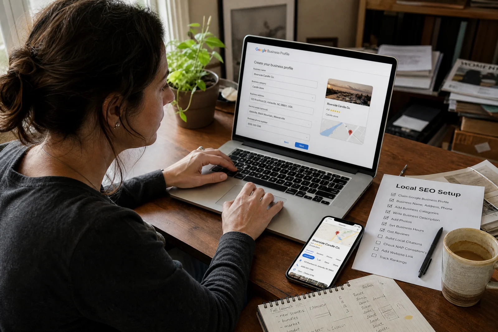
The boring local work matters more. Claim the Google Business Profile, fill out the services, add real photos, and rewrite the homepage so the city names appear where people and search engines can actually see them. For a local service business, that combination does more for early visibility than months of articles.
The difference is content versus visibility. A service business does not need to act like a national magazine on day one. It needs to prove what it does, where it works, and how someone nearby can reach it. If you serve multiple cities, build the service-area page. If the profile is half-empty, finish it before writing another article. An hour on Google Business Profile setup is worth more than a month of content strategy at this stage.
What a Small Business Website Design Service Should Include
Whether you hire the work out or build the first version yourself, the checklist is the same. It is the checklist we hold our own builds to.
Start with the homepage headline. Not the logo. Not the color scheme. One sentence that says what you do and where you do it. If someone lands on the site and has to scroll or click to figure out whether you can help them, the headline is broken.
Then make contact feel easy. Keep the form short enough that a tired homeowner can finish it from a phone, put the phone number where a thumb can tap it, and send yourself a test lead before launch. If the process annoys you, it will annoy the customer more.
Then claim your Google Business Profile. Fill out every section. Add photos. Write a description that mentions the city and the services. Most early leads come from local search, not from people typing the business name into a browser. We handle exactly this setup through our website and local SEO services, and we pair it with lead capture strategies and automation tools so the traffic that arrives turns into booked jobs, because a lead that sits unanswered overnight is usually a lead lost.
After that, build three pages: services, about, contact. Skip the blog, the portfolio, and the FAQ until there is a proven reason to add them. Most service businesses never need them, and the three core pages are enough to start getting leads.
The cost of delaying is not lost time. It is lost seasons. HVAC companies that launch in November miss the winter freeze. Landscapers that launch in June miss the spring rush. Plumbers that wait months for a build miss the calls that come in at 9pm on a Sunday when someone’s basement is flooding. A site that ships in weeks and catches the season beats a perfect site that ships after it.
The leads do not care if the site is beautiful. They care if it loads fast, makes sense, and gives them a way to call right now. That is the standard any small business website design service should be held to, and it is the standard we build to.