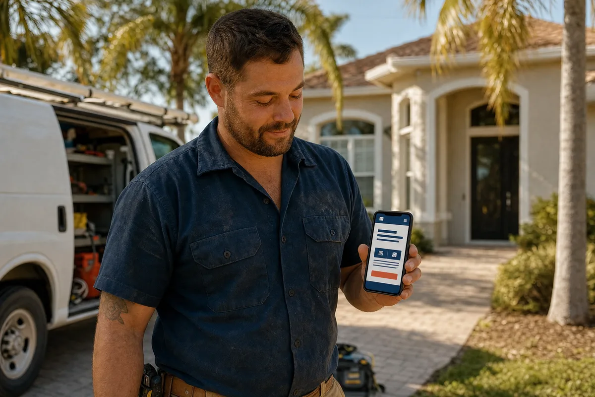
If you run a service business and your website isn’t bringing in work, the fix usually isn’t a full redesign — it’s getting four things right, in order: speed, phones, trust, and a clear next step. Most small business web design gets the look sorted and forgets that the site has a job to do.
That job is simple. Get you found, and get the visitor to call, book, or fill out the form. Everything else on the page is in service of that, or it’s in the way.
Here’s what matters, why, and how to tell whether your own site is pulling its weight.
Your website is the hub, not a brochure
Think about where your leads actually come from. A Google search. A friend who passed your name along. A Facebook post, an email, an ad. Every one of those sends the person to the same place to make up their mind: your website.
So the site isn’t a digital brochure you set up once and forget. It’s the hub everything else points back to. Your reviews, your photos, your follow-up, your booking — they all run through it. If the hub is weak, every channel that feeds it works harder for less.
That’s the shift in how to think about it. You’re not building a website because you’re supposed to have one. You’re building the one place where an interested stranger decides whether to trust you with their money.
It has to load fast
Speed is the part owners skip and visitors feel first. A site that takes a few seconds to show up loses people before they read a word.
Google’s own research found the probability of someone leaving a page rises 32% as load time goes from one second to three. Not three to ten. One to three. The visitor who bounces never sees your reviews, your service area, or your phone number. They’re already back on the search results, clicking the next company.
A lot of small-business sites are slow for fixable reasons: huge uncompressed images, a pile of plugins, cheap hosting. You don’t need to know the technical details. You need to know that a slow site is a leak, and it’s usually one of the cheapest to fix.
It has to work on a phone
Most of your visitors are holding a phone, not sitting at a desk. Mobile devices now account for around 62% of all web traffic worldwide, and for local service searches it skews higher — someone standing in their backyard typing “pool repair near me” is on their phone every time.
If your site was built for a desktop and squeezed down to fit a phone after, you can tell. The text is tiny, buttons are hard to tap, the phone number isn’t one touch away. That visitor doesn’t pinch and zoom their way to hiring you. They leave.
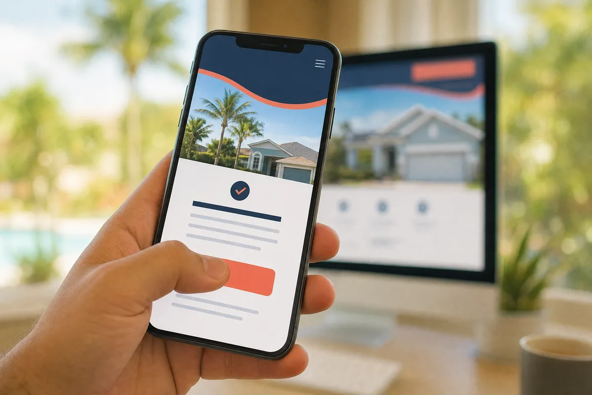
Mobile-first means the phone version is the one you design for, not the afterthought. The number should be tap-to-call. The form should be short enough to finish with a thumb. The most important thing on the page should be visible without scrolling.
It has to earn trust in seconds
People decide how they feel about a site almost instantly. Research on first impressions found visitors form a visual judgment in about 50 milliseconds — faster than you can read this sentence. Before they’ve read your headline, they’ve already decided whether you look legit.
A clean, current design does that quiet work for you. A dated, cluttered one does the opposite — it makes a great company look small. You don’t need flashy. You need clear, professional, and obviously run by someone who cares.
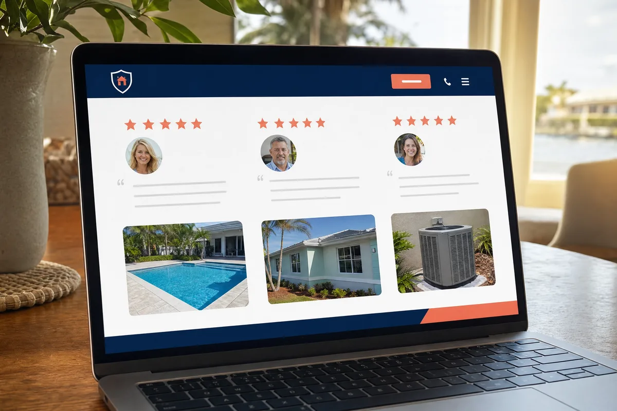
Then there’s proof. Local customers don’t take your word for it; they check what other people said. 97% of consumers read reviews for local businesses, so your real reviews belong on the page where people decide — not hidden three clicks away. Real photos of your work and your team do the same job. A site full of stock images of strangers in hard hats tells people you’re hiding something, even if you’re not.
If your site is slow, awkward on a phone, or gives a visitor no reason to trust you, that’s where the work is leaking out — and it’s worth knowing which leak is costing you the most before you spend a dime fixing the wrong one.
It has to tell people what to do next
This is the one almost everyone gets wrong. A site can be fast, mobile, and good-looking, and still bring in nothing — because it never tells the visitor what to do.
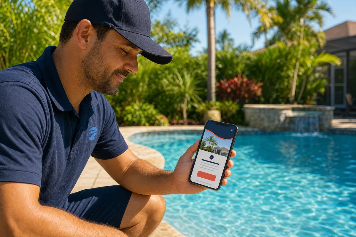
Every page needs an obvious next step. Call this number. Book this time. Fill out this short form. One clear action, repeated, easy to find on a phone. When a visitor has to hunt for how to reach you, most won’t. They’ll assume it’s harder than it is and move on.
Match the action to how your customers actually want to reach you. Some want to tap and call right now. Some want to book a time without talking to anyone. Some want to send a message at 9PM and hear back in the morning. Give them the path they want, and make it the most obvious thing on the page.
The marketing half: measure what it does
A website that brings in work is one you can measure. Not visits. Not likes. The numbers that pay you: calls, form fills, booked jobs.
This is where a lot of websites quietly fail their owners. The owner gets told to chase traffic and followers — vanity numbers that feel like progress but don’t put a job on the calendar. What you want to know is plainer. How many people landed on the site this month? How many of them reached out? Of those, how many became paying work?
When you can see that, the site stops being a guess. You learn which pages do the work, which words bring the right people, and where the path breaks down. That’s the real point of tying design and marketing together — not more dashboards, but knowing what’s actually earning its keep so you can do more of it.
How we think about small business web design at Blue Coast
I’ll be straight about why I’d trust us with this. We’ve built websites for service businesses since 2018 — 50+ of them — and we treat the site as a tool with a job, not an art project.
That means we start from your outcome, not a template. Who’s landing on the page, what they need to see to trust you, and the one action we want them to take. We build it fast, build it mobile-first, and put your real reviews and real work front and center. Then we make it something you can actually run — not a platform you rent from us and can’t leave if you go.
Most agencies hand you a pretty site and disappear. We build the site as part of the system that brings you work, and we teach you how it runs. If you want the website handled properly, that’s what custom websites is for, and it’s the front door to Business Autopilot — every system your business needs, built once and left in your hands.
What to do next
You don’t need a full redesign this month. You need to know which of the four — speed, phone, trust, next step — is leaking the most, and fix that one first.
If you’re not sure where your site is losing work, take the free Automation Scorecard. A handful of quick questions, about a minute, and you’ll see your biggest bottleneck and the fixes worth making first. No sales call at the end — and if it makes sense, you can book a free audit right from your results.